In brief
-
01
Client
German manufacturer and reseller of furniture for children’s rooms
-
02
Task
- Improve user experience: redesign the logic of the main menu and catalog, and the appearance of product cards.
- Add a landing page builder, and a feedback page with a FAQ section.
-
03
Project
Online store — Custom Shopify Development
-
04
Kind of tool
Shopify eCommerce development platform
-
05
Why we chose it
- Focused on Shopify help for Western audiences.
- Subscription includes online trading tools by default.
- Rapid store expansion possible.
- Easy to use admin panel
-
06
Results
As Shopify experts, in just 25 working days, we developed a design system, created logical navigation, optimized the product cards, and added a mechanism for creating landing pages and a feedback page.
The company has grown, and their old Shopify website online store was outdated.
This German company sells furniture for children’s rooms on the Western European market. There’s an online store on Shopify, but the client doesn’t like it. The design is outdated, it’s inconvenient to fill out product cards, and there are so many products that it’s difficult for buyers to find the one they need. They needed some professional ecommerce website development help.
Why choose Shopify?
Shopify is an online store builder and hosting platform with a paid subscription. The Shopify eCommerce Development service offers many convenient tools for online trading by default. Additional functions can be found in annexes to the main system.
The client initially chose Shopify because this platform is especially popular in the US, Canadian, and European markets. It includes Shopify Theme Development & Customization, great Shopify Support, Upgrade & Maintenance Services, Shopify Migration services, and many other advantages:
- It’s friendly with American services by default: it easily integrates with Facebook and Instagram, and is well-indexed by Google. There’s no need to hire specialists to drive traffic or for SEO optimization.
- Product Migration to Shopify is direct and no-nonsense.
- For us as a Shopify developer, it has many built-in tools for online trading, such as hosting, an SSL certificate for a secure connection, and payment infrastructure in accordance with the PCI standard. There’s no need to do this separately, which saves time and effort.
- eCommerce Development and ecommerce website design with Shopify don’t require deep programming knowledge. To create an online store, you don’t need a large team. On this project, we only needed a designer and a layout developer.
- The platform has a simple and clear administrative panel. It’s easy for the client’s staff to work with.
- The Shopify store is easy to scale. The service is suitable both for a small workshop with big ambitions, or for a huge hypermarket.
- The Shopify website builder, Shopify app development, and Shopify integrations are straightforward and easy to accomplish tasks.
Entrepreneurs trading in the territory of the format CIS countries might hesitate seeing Shopify’s lack of built-in integration with the MoySklad and 1C systems. However, this isn’t a reason to give up on its benefits. If a company isn’t intimidated by the platform’s tariffs, an experienced developer can programmatically configure the necessary integrations.
Redesigned appearance and navigation
Before starting development, we discussed with the client the design problems of the old online store, and their wishes for a new one:
- The external design of the site was created a long time ago and is outdated.
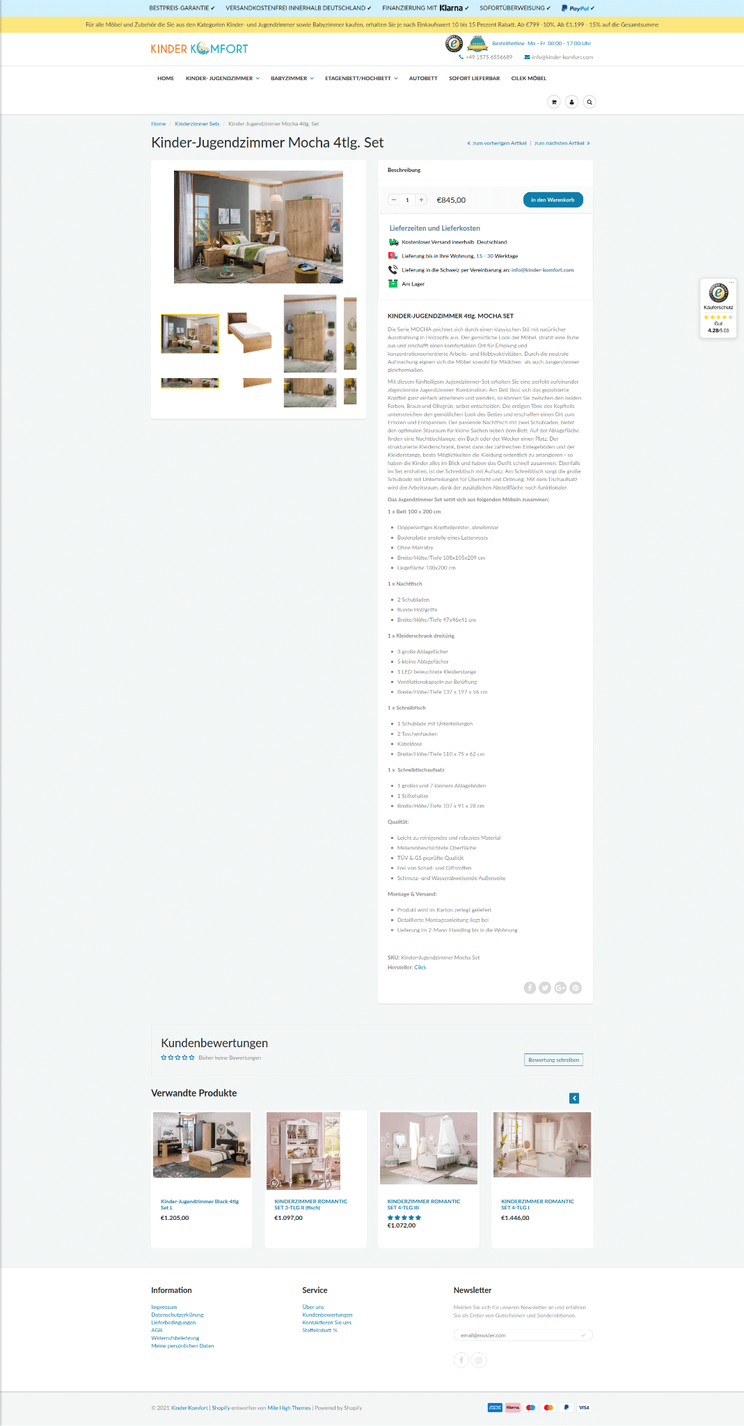
- Navigation suffers: there is no clear structure in the catalog, all goods are simply in one big group. So, in order to find the main product of the company — ready-made children’s rooms — a user must first select the age of the child, then gender, and only then proceed to the selection of the collection. The more difficult it is for a customer to find what they need, the more likely they are to abandon their purchase.
- Cards of goods are not informative. The parameters are listed in solid text in a single window. This is inconvenient for the buyer to read the description, and makes it difficult to choose a product.
- We formulated the terms of reference. We described the stages of work, the functional structure of the new site, and designed a new, logical user path.
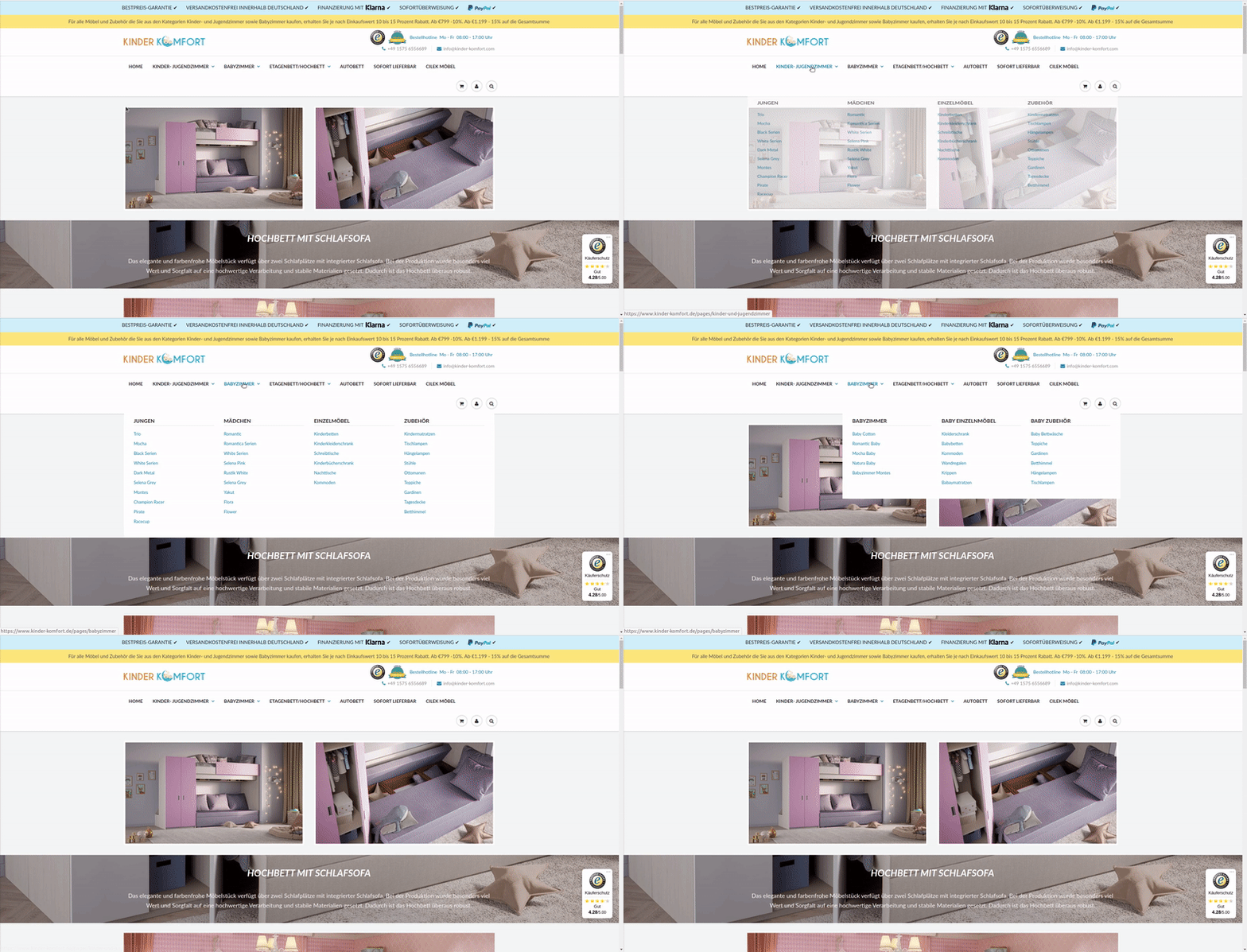
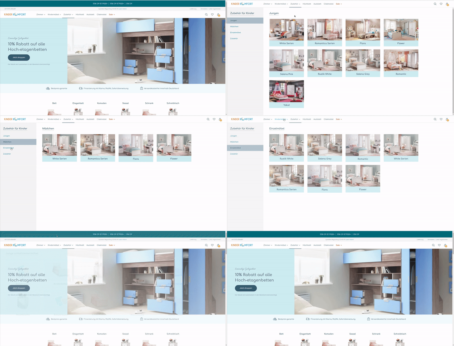
Instead of just drawing a new kind of interface, we developed a design system for the client. This is an integrated approach to the design of software products, combining design and programming:
- A designer creates the main visual elements: the appearance of buttons, icons, panels, and other components of the interface using the client’s corporate colors, fonts, and logo.
- The rules of application are described: where and how to use each element.
- A developer recreates visual elements in program code, and forms a framework from them: a library of components in a single repository.
From such ready-made components, design bricks, you can assemble interfaces for a given product and any future, even with a different team, over and over again. For example, if a customer wants to expand the store or release an application.
The benefits of design systems are especially noticeable in large projects where many interfaces need to be designed. The traditional approach takes a lot of time for rendering layouts and programming. Errors inevitably appear in the process. For example, someone might miss the color of the buttons in the application, or someone on the site might miss the size of the fields, and so on. The development of a unified design system automates such processes, eliminates errors, and saves time.
In order for the client to see how an online store with a new design would look on different devices, we laid out static HTML pages. These pages are not connected to the server, but look like full-fledged site pages, «frozen» at different stages of the user’s journey: choosing a product, send products to the shopping cart, placing an order, and so on.
After approval, we proceeded to the development of the design theme. The task was complicated by the fact that the old store had to keep working until the customer switched to the new theme with a new directory structure. To do this, we made additional temporary logic that ensured the continued work of the old store structure.
Redesigned pages of furniture collections
It’s more profitable for a store to sell not just one piece of furniture, but whole rooms, i.e. sets of furniture, lighting, textiles, and decor made in the same style, everything needed to completely furnish a nursery.
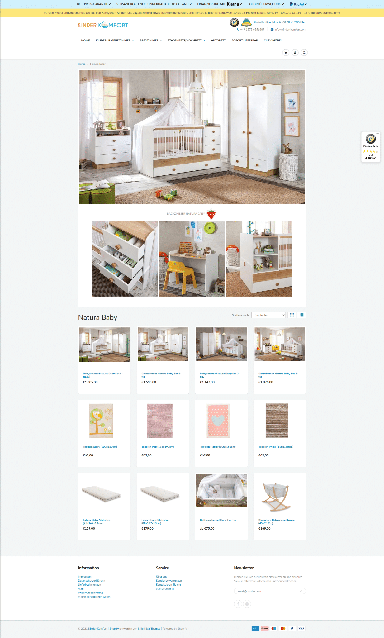
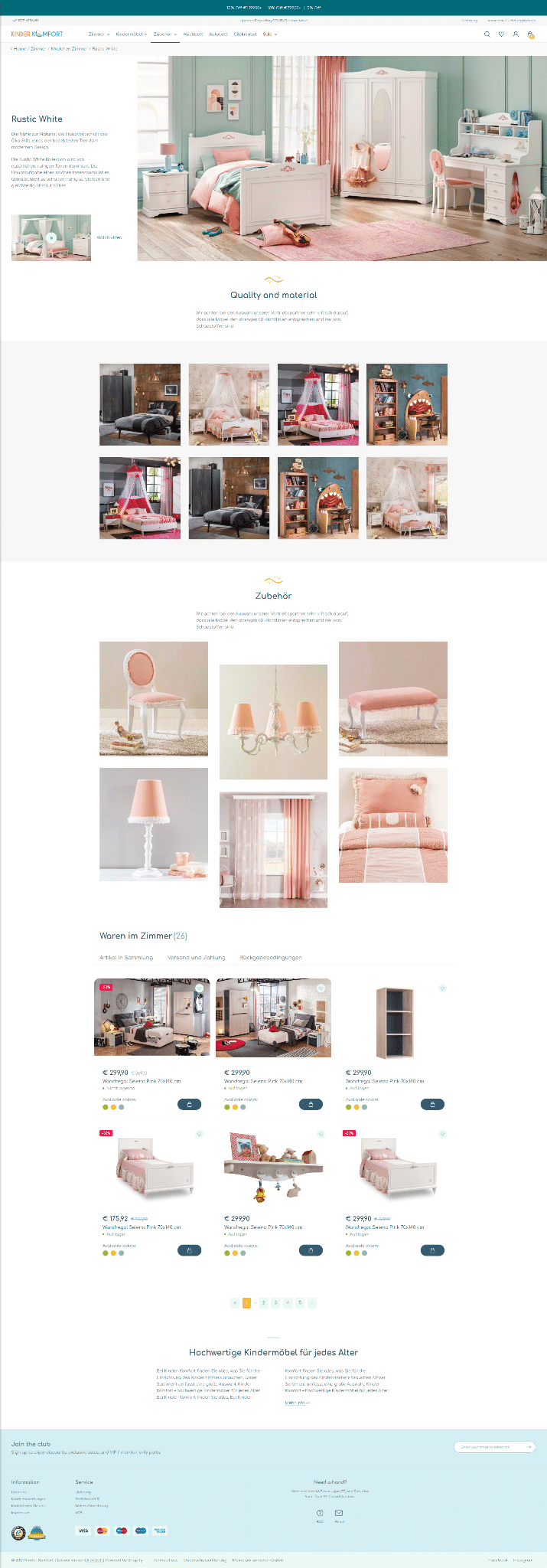
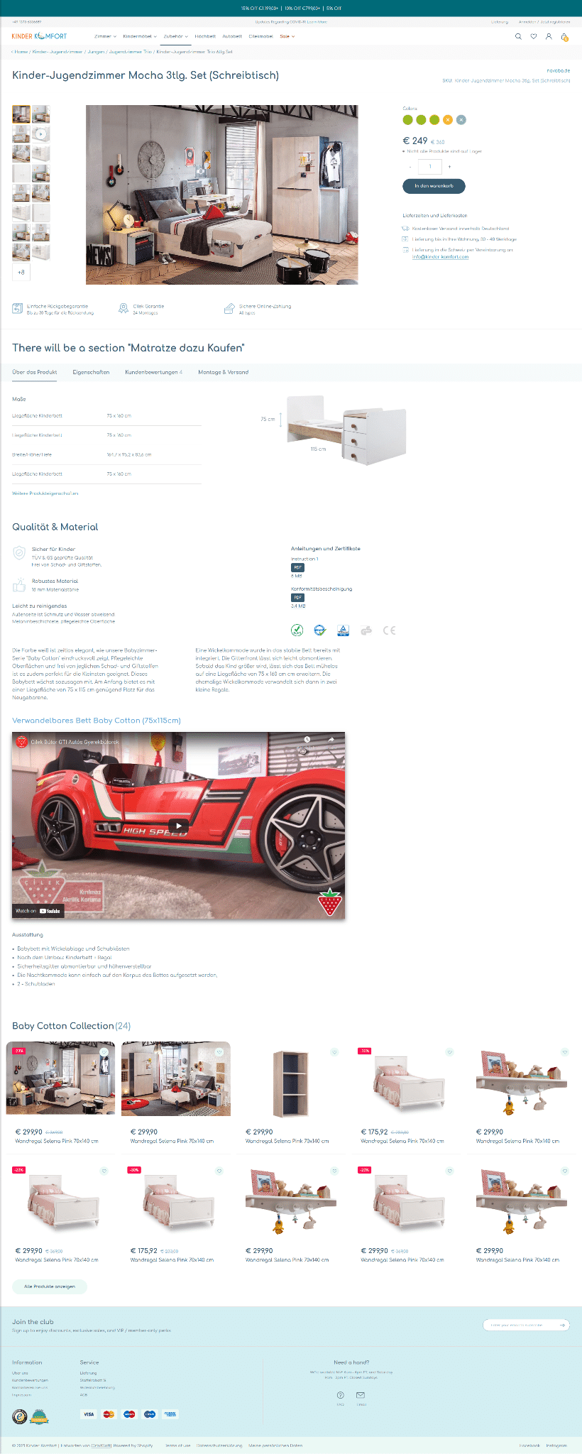
On the old site, the pages of the rooms contained only photographs, the cost of various configurations, and links to individual items from the collection. We added sections with text descriptions, a section with accessories from the collection, and the ability to upload a video about the room.
The basic version of Shopify doesn’t support so many extra fields, so we used a Custom Fields app. Shopify apps are plugins, add-ons that extend the functionality of the main service. Add-ons are created by third-party developers and uploaded to the Shopify App Store.
Redesigned individual product pages
In the old version of the online store, product cards had to be filled regularly. The entire description was in one large field. It was cumbersome, and inconvenient for buyers to read. The client had to use lists to separate blocks of information from each other. Adding new products, and editing already created cards, slowed everything down.
We created additional fields using the same Shopify Custom Fields app:
- We changed the logic of displaying delivery options and the availability of goods in the warehouse.
- We added a section with PDF-documentation for goods. For example, certificates, and instructions.
- We added a section with a video about the product, which is downloaded from the company’s YouTube channel.
- Dimensions, product characteristics, and customer reviews were moved to a separate system of tabs.
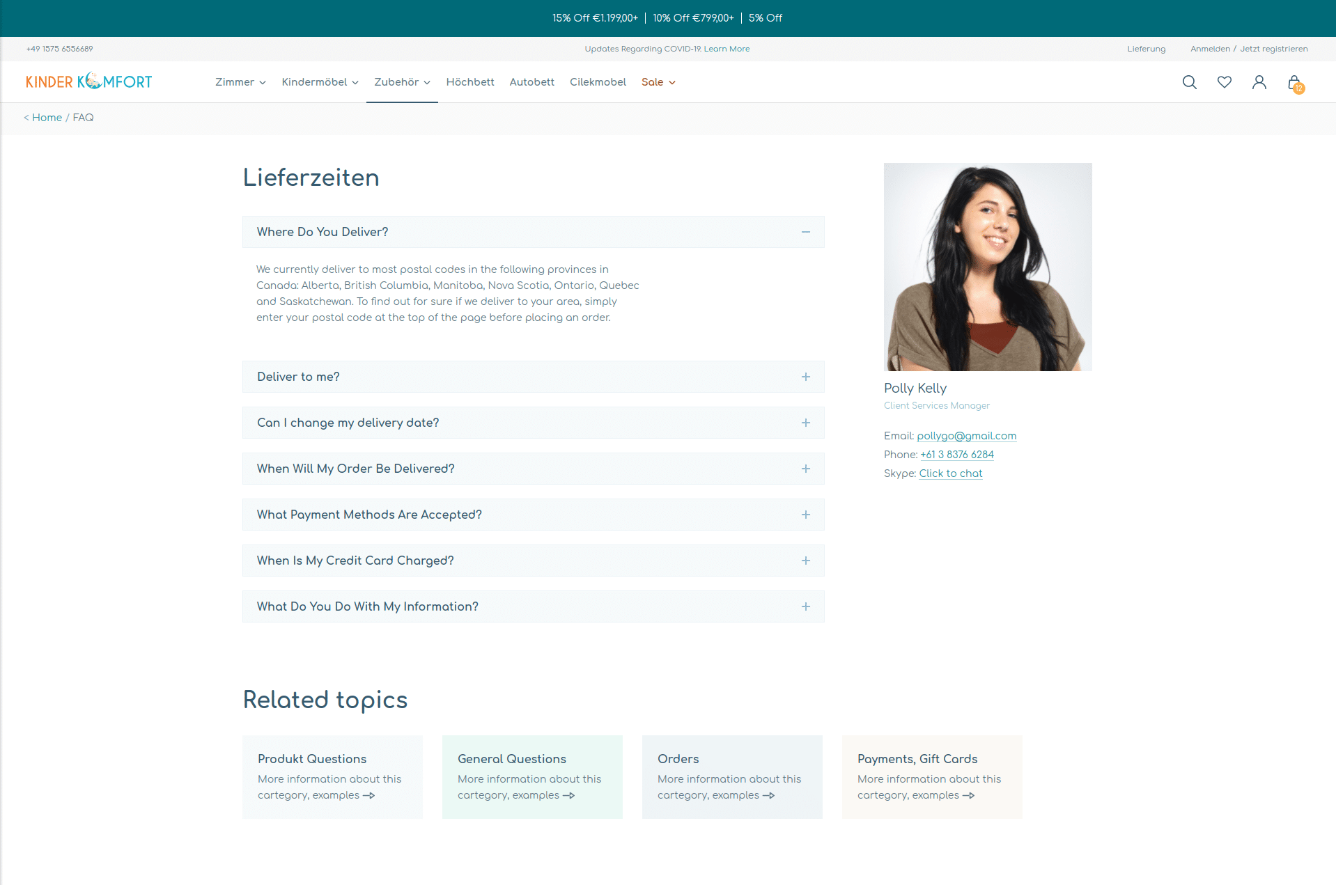
We added a feedback page, and the ability to design landing pages.
Landing pages are needed when a company is promoting on social networks or search engines. For example, the company announces a sale for a specific furniture collection and talks about it using targeted Facebook ads. By clicking on the link, the buyer wants to see information about this particular promotion. Therefore, instead of going to the general catalog, the customer should go to a landing page — a page dedicated to a specific advertising campaign.
We added a designer for such landing pages to the admin panel. The administrator chooses a suitable template, arranges sections, customizes them, and fills them with content: text, pictures, and goods from the store.

We also added an online customer support page. Previously, the company could only be contacted by phone or email. We designed FAQ sections, and Skype chat with a store employee.
Trained store employees
We prepared tutorials on working with the admin panel, added screenshots, and screen recording of non-obvious theme settings. At our meetings, we conducted express training for employees.
Results
The development of an online store for children’s furniture on Shopify took 25 working days. We:
- made a design system that the client can use in the future to expand the store and develop additional services.
- created logical navigation, and optimized the product cards. The user journey has become clearer and easier, and this will help the store to increase sales.
- added a landing page designer. Managers will save time running advertising campaigns to drive traffic.
- created a feedback page. It will be easier for buyers to contact the store and solve their problems. This will increase both service satisfaction and repeat sales for the company.
The customer’s employees fill the new store with content: they update product photos, add images for categories, and fill in new fields and sections. Due to temporal logic, the old version of the store also works at the same time as the new one, so that the company can continue to take orders and make a profit. The customer will be able to turn off the old store as soon as the new one is ready.
