What is an interface, and what does a UX/UI designer do?
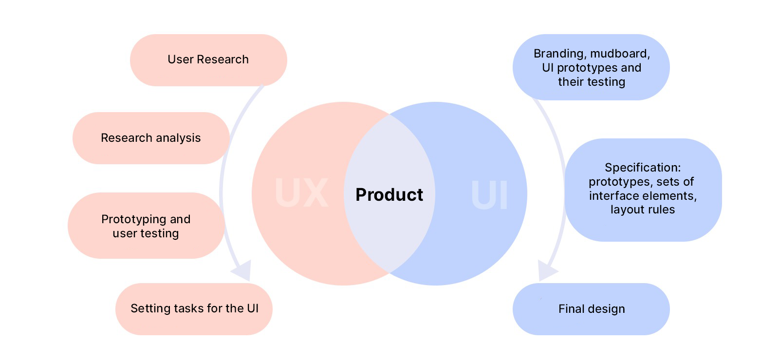
UX/UI is a methodology for creating user-friendly and aesthetically pleasing graphical interfaces for programs, websites, and applications. UI is everything a user sees and interacts with: text fields, buttons, sliders, carousels with pictures, etc.
UI design (User Interface) — User interface design. The UI designer develops the appearance of the application or website, and selects the combination of fonts, color palette, shapes of buttons, etc.
The interface should not just be beautiful. Its main task is to help the user navigate the product, and find necessary sections and information faster.
UX-design (User Experience) is the design of user experience. A UX-designer thinks through the logic and structure of a product, the user’s path from first contact to the target action. For example, from entering an online shop, to making a purchase.
The goal of UX is to make the user’s journey as short and intuitive as possible so that the user gets the result they desire faster, and is satisfied with it. For example, buying an item with one click, or registering without having to call support for help.
You can’t do UX separately from UI. They are two mandatory parts of product design. Therefore, the UX/UI designer is usually a single specialist. He or she works on the project in several stages, for example:
- Conducting UX research, such as studying user needs and behavior through market analysis, surveys, and focus groups.
- Developing the logic of the future product with the help of prototypes.
- Creating interface elements and building their mock-ups.
- Testing the finished application on users, and refining it based on test results.
UX/UI design is less about beauty and more about usability. If you don’t think about the user experience when designing an app, it can be beautiful but not user-friendly. Customers won’t use it, and will look for alternatives. In the end, the company will spend money on the initial development, miss out on profits due to a failed launch, and then research and re-launch the product anyway.
If UX/UI is given enough attention at the initial development stage, customers will have a positive experience, use the app themselves, and recommend it to their friends. It turns out that spending on UX/UI is a very important kind of investment. The company invests money at the start, and then receives dividends in the form of additional profit.
This article shows how UX/UI design improves the user experience, as well as benefiting the business, using examples from our projects.
How UX/UI design boosts business performance with OrbitSoft projects
Case 1. Conducted UX research, changed the UI design and achieved 294,000 downloads in 4 months
Client: A Canadian service with video entertainment content.
Problem: The client wants to enter the Asian market, but doesn’t know anything about the habits and needs of the new audience.
Task: Adapt the app to the new target audience.
Solution: Conduct UX research among Asian users and change the UI design
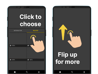
Initially, the service’s audience was America and Europe. Users watched videos in the YouTube format: the app had a catalogue of a grid of horizontally arranged videos, and people chose which video they wanted to watch. To find out whether this format would appeal to Asia, we analyzed the new audience and the content formats they were used to.
It turns out that the YouTube format is unpopular in Asia. They are more used to the mechanics of TikTok, an endless stream of vertical videos that the user watches one after another by flipping upwards with their finger. For the Asian audience, we developed a separate app with an interface similar to that of TikTok.
Result
By conducting UX research and redesigning the interface according to the habits of the target audience, errors and waste were avoided. The app became an instant hit in Asia, with 294,000 downloads in the first 4 months.
Read more about the project in the article An app with TikTok mechanics: how we helped a company enter the Asian market
Case 2: Changed UX design and doubled conversion rate
Customer: POSiFLORA, a CRM system for the retail flower industry.
The problem: A lot of interested visitors come to the site, but only 0.005% fill out applications to purchase the system.
Objective: To find out why people don’t fill out applications, and to increase the conversion rate.
Solution: Conduct a UX study to understand what changes to the site users need.
We gathered a focus group of users of the service — employees and owners of flower shops. We asked them to test the site and evaluate how convenient it was to use. The research yielded several hypotheses and insights into how to change the design of the site to improve user experience.
Conclusions of the UX research
| Section of the site | Hypothesis | What’s changing |
| Main page | Too much information. Users find it difficult to understand the features of the system. They cannot find a solution to their problem and close the site. | On the main page leave only those blocks that tell the client how the system can solve their problems. |
| The lead form is a block where the user leaves contact information | When filling out the lead form, the user needs to write what they need the system for. People get lost and close the lead form before they get to the application. We need to help them articulate the task at hand. | We change the user’s path to the lead form, and add interactivity: first we suggest choosing the type of business, then several tasks from a suggested list, then suggest leaving contact info. |
| Reviews of the system | The reviews do not look real, so they are not very trustworthy. | Let’s integrate the site with Yandex and Google maps, so that live reviews from these services are pulled up to the main page. |
| Corporate Blog | The site has a blog with stories of entrepreneurs telling how the POSiFLORA system helps their businesses. But new users don’t notice the blog. | We put information about the blog on the main page, and tell users that every week we publish stories of businessmen to whom POSiFLORA has helped set up and improve their processes, and increase earnings. |
Result
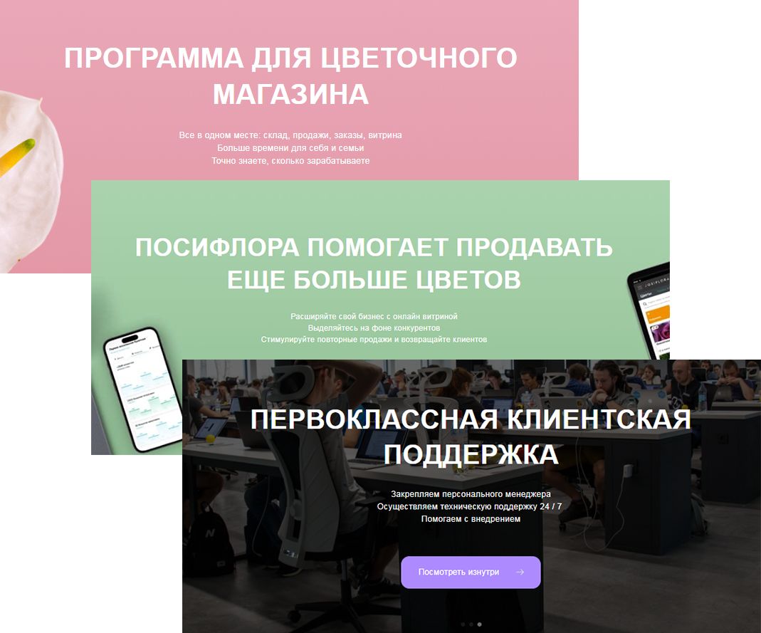
The research helped us see the shortcomings of the site through the eyes of users. We redesigned the site based on their opinions, and we succeeded:
- Increased conversion rate by 2 times
- Reduced bounce rate by half
- Increase traffic to the blog 1.5 times
| 1 Jan — 17 Feb 2022 | 1 Jan — 17 Feb 2023 | |
| Site | ||
| Traffic | 22 302 | 24 890 |
| Applications | 122 | 242 |
| Conversion of traffic/applications, % | 0.005 | 0.010 |
| Refusals, % | 26.75 | 12.50 |
| Blog | ||
| Traffic | 17 291 | 27 022 |
| Applications | 33 | 82 |
| Conversion traffic/applications | 0.002 | 0.003 |
Case 3. Studied the user journey, fixed bugs in the interface, achieved 250,000 downloads
Client: A Canadian company that manages advertising on entertainment content services.
The problem: Due to blocking, users in some countries could not access the customer’s resources. The company developed a VPN application to open access to content. Users downloaded the application, but left at the registration stage.
Task: Find out what’s wrong with the user experience.
Solution: Conduct a UX study, fix the bugs.
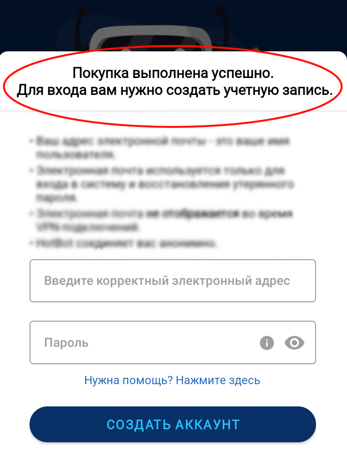
We conducted research and discovered what the problem was: users had to register before choosing a tariff. Many people didn’t like this. The potential customer hadn’t yet seen the cost of the subscription, and the app was already asking for their email, phone number, and billing address. Customers would leave as soon as they saw the fields for entering personal data.
We made the logic of the app familiar to the client: first select a tariff, then register.
Result
Customers began to actively use the application. In the first year after the update the app was downloaded more than 250,000 times. Read more about the project in the article What we use Swift for: an example of a VPN client application
Case 4. Accelerated the development of a site with the help of a design system
Customer: A German manufacturer of furniture for children’s rooms.
Issue: The online store was created a long time ago and is obsolete, in addition to the company’s collection having grown significantly. It has become difficult for users to navigate the site.
Objective: To update the site and provide for the possibility of future further business scaling.
Solution: Completely redesign UX/UI interface. Develop a design system: a set of ready-made interface elements and rules for their use.
An online store is a site with a huge number of pages. We could traditionally render the interface of each page, but this approach has several disadvantages:
- It would have wasted a lot of time.
- Mistakes are inevitable: for example, you paint the stripes wrong for the brand book, or make the margins the wrong size, etc.
- When the client wanted to scale (to add a new section to the site, or release a mobile app), all the interface elements would have to be rendered again.
Instead, we developed a design system:
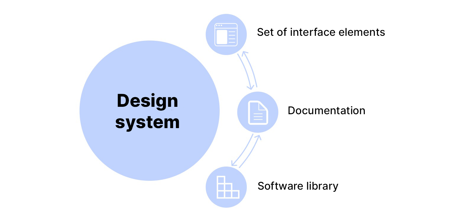
- The designer designed the main visual elements of the interface: buttons, bars, and icons, and produced documentation: rules for using these elements on the site.
- The developers described them in code, creating a library of components.
- We assembled all pages of the online store from library elements, quickly and error-free.
Result
- With the design system we developed a new website in 25 days. The traditional approach would have taken 3−4 times as long.
- The design system will make it easy for the customer to scale in the future. They will be able to expand the online store and create new sites and applications in a single design system using the same component library.
- The design system makes it easy to make changes. For example, if a company decides to change the color of the «contact» button, it’s enough to edit that element in the library: the color will automatically change on all sites and pages that access the library.
Read more about the project in the article Case study: how we remade an online store on Shopify for a German company
Conclusions
- UX/UI design helps to create beautiful and convenient products that users like, as well as increasing revenue for companies.
- UX- and UI-design are two halves of a single whole: first we make a thoughtful UX, then an attractive UI. Then users of the app or website have a positive experience, they will use the product themselves, and recommend it to friends.
- UX research increases the chance of releasing an in-demand product that users will like. It also helps with understanding what problems a launched product has, and can assist with dramatically increasing conversion rates.
- Design system development helps speed up the creation of websites and apps, forming a unified visual language for a product.
