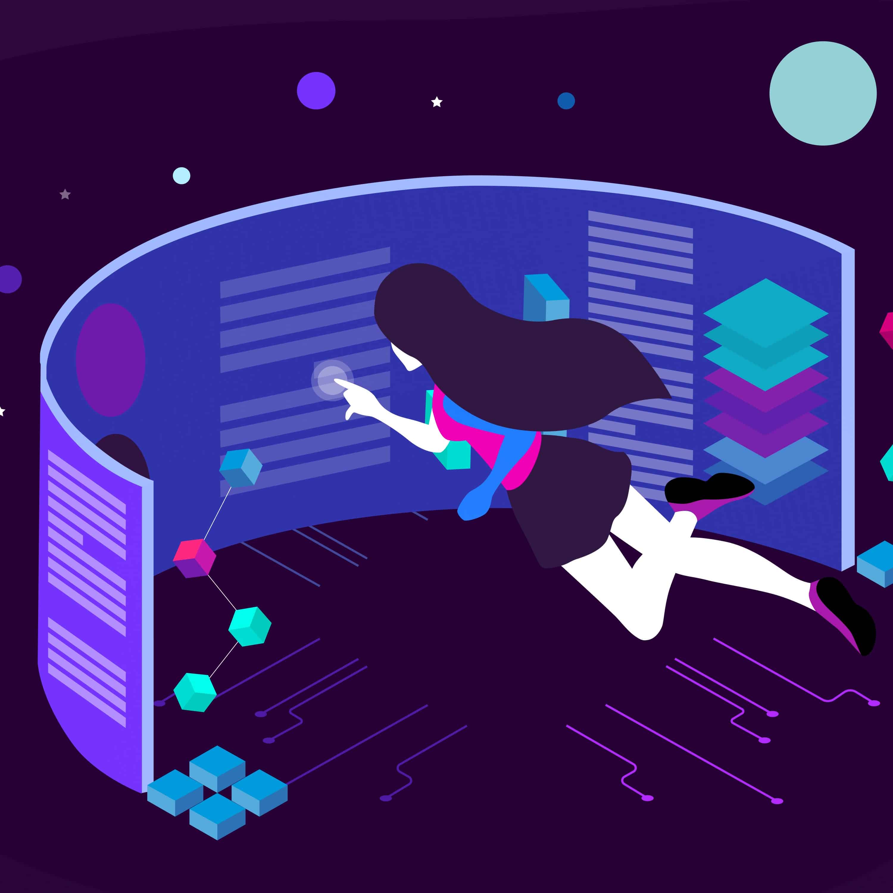
A digital product will be in demand if you take care of customers from the start. Think not only about the visual beauty of a site or application, but also about its logic, structure, and ease of use. This is the task for a UX/UI designer: to analyze the preferences of the audience, and design a product that is easy and pleasant to use.
In the article «How UX/UI Increases Profit» we talked about how UI differs from UX, what a UX/UI designer does, and how competent design increases business performance, using OrbitSoft cases as an example.
But even the most beautiful and functional design should change over time. In order for a site or application to continue to attract users, a close eye needs to be kept on new trends in digital product design.
In this article, we’ll analyze which trends in UX/UI design need a closer look in 2023, and how to adapt them to your products. Let’s focus on fashion trends in visual design, fresh ideas in interface design, and modern UX/UI designer tools.
Visual trends: neo-brutalism in design, typography, and nostalgia for 2000s
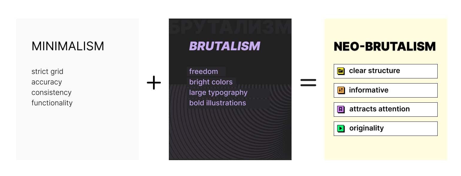
One of the most popular visual design trends over the years has been minimalism. It’s characterized by accuracy, geometric layout, dusty colors, soft shadows and gradients, rounded corners, and a lot of empty space around elements.
However, in recent years, many have tired of minimalism. For a short time, its opposite came into fashion: flashy, provocative brutalism. It’s characterized by an asymmetrical layout, rich colors in unexpected combinations, large typography, dark shadows, and clear element borders.
In 2023, these trends merged into an interesting mix: neo-brutalism. This trend takes logic and structure from minimalism, and combines strange illustrations, powerful typography, and brightness from brutalism. Such design both attracts attention and helps convey complex information.
In neo-brutalism, as in brutalism, it is customary to use saturated, undiluted colors, and break the rules for their combination, the brighter the better. For example, you can easily combine red and blue or red and green.
Instead of the high-resolution photographs that are typical of minimalism, designers draw strange illustrations that resemble template shapes from an old PowerPoint presentation. Add to this right angles, no gradients, bold black shadows, and the site looks like early 2000s software. Remember «Kerchief», for example. Nostalgia for 2000s interfaces is a trend that will also continue in 2023.
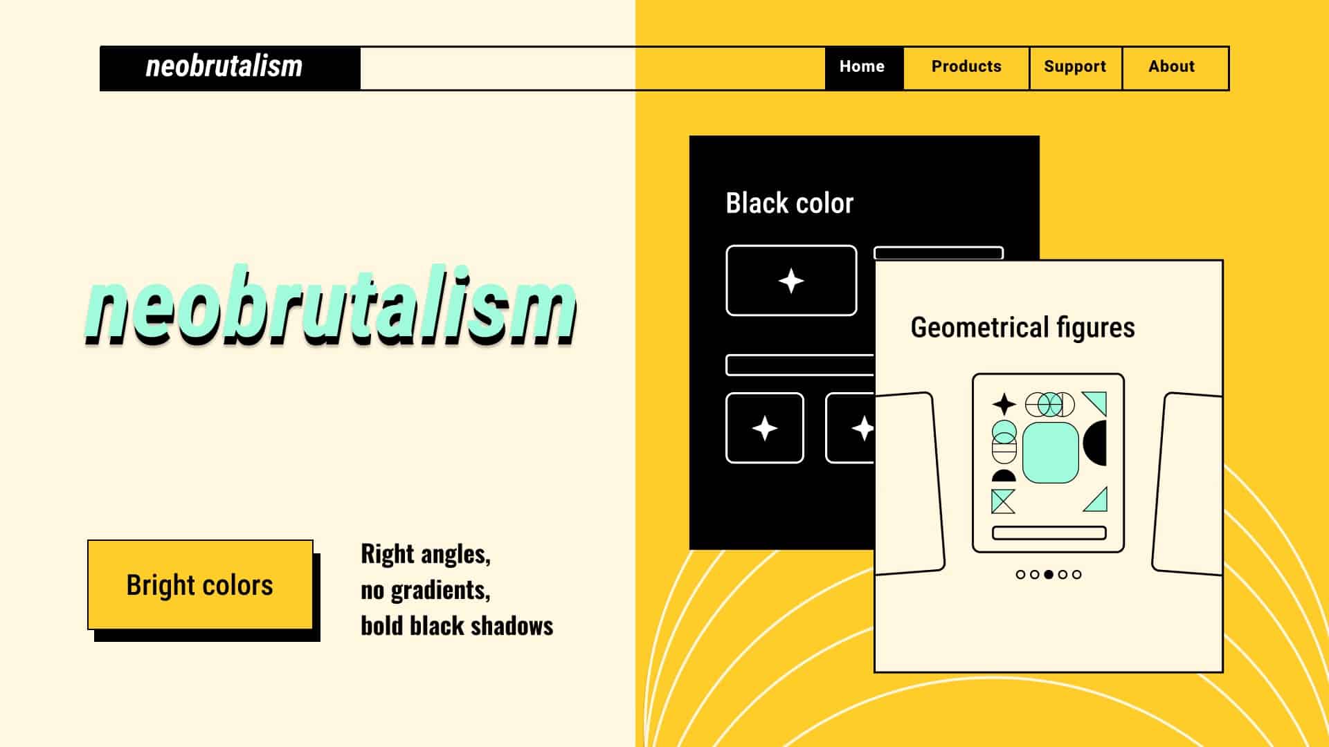
Typography plays the same important role in neo-brutalism as in brutalism, but thanks to the influence of minimalism, it looks calmer. To attract the attention of users, you can use unusual, bold, and rather large fonts with a contrasting background, like in vintage posters. But the main task in the end is to achieve maximum readability.
UI Design Trends: Intuitiveness and Focus on Mobile
When a user opens a website or downloads an app, it only takes them a few seconds to decide whether to continue using it or to close it. If the logic of a product is not obvious, a person will most likely not waste time studying the instructions or writing support, but will simply find another product that is easier to interact with.
The intuitiveness of the interface today is no longer even a trend, but a necessity. But what is obvious to the creators of a site or application is not always obvious to its users. To design truly intuitive digital products, you need to conduct UX research: to study the needs of the audience, release a test version, and collect feedback.
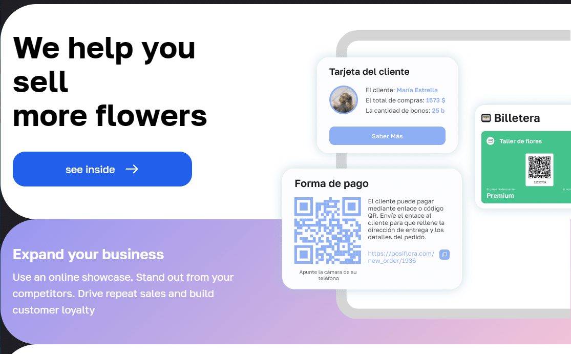
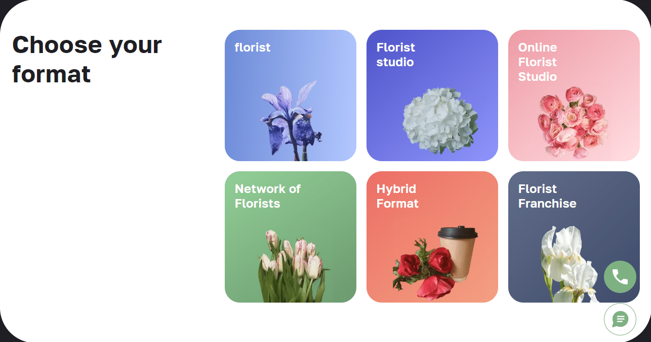
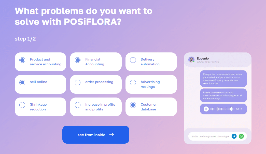
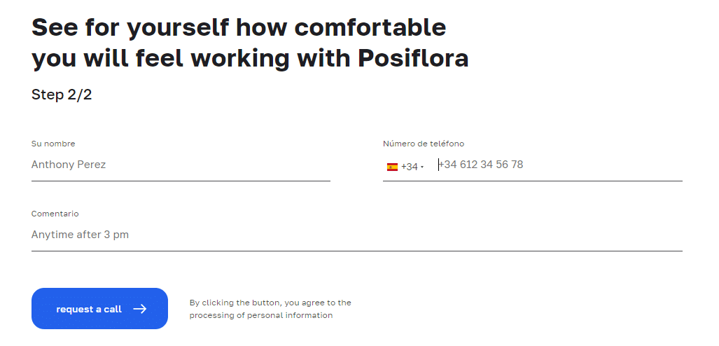
In this way, UX-research helped us to double the conversion on the advertising site of the POSiFLORA CRM system. We interviewed users of the system, analyzed their experience, identified problems and changed the UI design.
For example, earlier, when filling out a lead form, it was necessary to manually indicate the type of business and tasks that the client wanted to solve using the system. It was difficult for people to formulate a request, and some of them left the site.
To help users, we made cards with ready-made options: first, we suggest choosing a business type, then tasks from a ready-made list, and then to leave contact info in the lead form. In the end, the client needs to do almost nothing: the site practically leads them by the hand.
The study of user experience can shed light on other habits of the target audience. For example, what devices they use. Previously, the development of sites, by default, started with the desktop version. Now more and more emphasis is placed on mobile-first solutions.

Trending UX/UI Designer Tools: Figma and Neural Networks
Figma is an online platform for website and app design. Figma is so amazing that over the past few years it has become not just a trend, but a must-have tool for all UX/UI designers. There are several reasons for this:
- Figma: Figma is an online cloud platform like Google Docs. This means that the prototype site or application can be viewed by simply opening a link in a browser. The whole team works on the project at the same time thanks to sharing. Each member of the team can get the source code of layouts by simply downloading them from the cloud. All of this speeds up and simplifies the development of sites and applications.
- In Figma, you can create a library of visual elements: buttons, icons, lead forms, etc., and assemble interfaces from them like from a constructor. If we need to change the color of the buttons, we edit the library element, and the buttons are recolored on all layouts at once.
Next, developers describe these visual elements in code, and create a programming library based on them. Altogether, it’s already a design system. It allows you to make changes at once on all pages and screens that access this library, and quickly create other digital products in the same visual style.
Neural networks, unlike Figma, are a new tool for designers. While some designers struggle with them, others are learning to use the power of artificial intelligence to simplify routine tasks, speed up development, and save customers money.
At OrbitSoft we use several services based on neural networks.
Slazzer cuts out backgrounds from images and saves them in PNG format. The tool helps when you need to cut out a lot of images, for example, for product cards in an online store. Previously, Photoshop was used for this, where it took about half an hour to cut out one image. Slazzer does the same in a couple of seconds.
Image Tracer is a plugin inside Figma. It allows you to create a vector image from a regular image in 2 clicks, which can be enlarged several times without loss of quality, even for a website, and even for a billboard.
Looka creates logos based on text queries, color palette, and reference images. Of course, we don’t use the generated results in their pure form. The tool helps to quickly generate ideas and understand in which direction to move. Previously, sketches took half the work day. Now the neural network generates them in just a few minutes.
Main ideas, in brief:
- A digital product will be in demand if you care not only about the visual beauty of the interface, but also about user experience. To keep your website or app up to date, you need to follow UX/UI trends, and adapt them to your products.
- The main visual trend of 2023 is neo-brutalism. It takes logic and structure from minimalism, and combines strange illustrations, powerful typography, and brightness from brutalism.
- Neo-brutalism uses references to interfaces of the 2000s, and bold, large fonts with a contrasting background, the main goal of which is maximum readability.
- In 2023, the trend towards intuitive interfaces continues. But now it’s not enough just to try to just design the most logical interface, but to confirm hypotheses with UX research.
- Most people use smartphones, so the production of new digital products starts with mobile versions.